
Another look at the Obsidian Sands of Syncrates cover
Yesterday I posted the color finished front cover for the Obsidian Sands of Syncrates cover. I figured I'd post the B&W original so that you can see some of the process involved and just how much of a team Daisey and I are when it comes to doing the color works.
It all starts from the art direction. Everyone tends to approach this a little different, but usually it takes the shape of a verbal sketch of the cene to be depicted and a size of the overall drawing. For this particular piece, Joe Browning uses cover images that are sized 5" x 7.5". You can visit the descriptive text on Joe's blog here. Some folks are very veribose and meticulous in their verbal depictions, others are very sparse. I think Joe's strikes a nice balance in that he frames a scene but gives me a lot of leverage in using my artistic vision to visually depict the scene.
Next, I'll usually pull out my sketchbook and do a rough thumbnail sketch. For this image, I roughed it out very lightly on the bristol board itself. Normally this is only something I do if I have a strong impression of what I want the final scene to look like. Otherwise I run the risk of "polluting" the surface of the final image by making marks that are difficult to erase of cover up in the final image.
For the 5"x7.5" pieces, I like to use 9"x12" bristol board. I then procees to "frame" my work by drawing a 1" border inside the work. This is mostly for psychological reasons as it helps me break the stark white of the page and gives me a frame of reference to work from.
I then proceed to pencil the image in with my trusty mechanical pencil. I also have some cool pencils that are made from recycled newspapers. I usually will use those to do the "finished" pencils. When I get the main line drawing portion done, I'll go back and start "spotting" my blacks - the areas that will later be filled in with solid black. Some artists just annotate in the drawing itself where the solid black areas are by placing x's or other marks. Others will actually shade in the entire area with pencils. I tend to do a mixture of the two. For smaller areas, I pencil them in. For large areas of solid black, I'll simply place some marks so I'll know that it is black later on when I begin inking. I find that if I use pencil on the large areas, later when I'm erasing the pencil marks, it tends to weaken the strength of the black ink. Anyway, that's the method that works for me.
Here's the end result of this stage in the process:
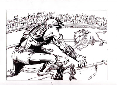
The finished inked image is now ready to be scanned into the computer. I'll import it to Photoshop and the rest of the process will begin. But first, I want to back up a step and mention Daisey's contributions up to this stage. Normally, Daisey doesn't usually read the art direction - she pretty much relies on my interpretation. While I'm penciling the work, she may offer some contributions in the form of suggestions to composition. Her greatest contributions come in the inking stage where she helps quite a bit with determining just how much black I should use. She has been great at encouraging me away from the crutch of using too much fussy detail to define an image and relying on form and context. So her eye helps play a critical role in helping determine the composition.
At this stage, Daisey takes over, and we reverse roles. She defines much of the color with me only imputing critical items that need to be depicted a certain way (i.e. the obsidian sands in this case). I offer my input on design decisions but the choices at this stage are largely hers. Daisey will often use reference photos to help define texture, pattern, lighting, etc. Here's two reference pictures she used on this work. The first she used to help work on the sand for the arena floor:

The next is what she used to help define the marble of the statues:

Once we finish, we save the work in a folder on the computer with the other color works and do a slide show. This helps us determine the strengths of the piece by visually comparing it to other works we've finished. Here's what it looks like at this stage:

I then go back in and crop it and size the image to the proper dimension. Here's the end result that gets sent in to the publisher:

Now the publisher applies their layout magic and we end up with the final result:

And thus you have the end result that is born of a symbiotic relationship. Having two creative types in the house is great as we are able to feed off eachother's energy to drive our projects, be able to openly and constructively provide feedback to help strengthen our endeavors, and its just plain cool to be part of a great team. And we do so hope that you enjoy the fruits of our labors. It is a joy to be able to bring these fatastic scenes to life!


.png)
Thanks for the behind the scenes peek! I always find such stuff interesting. I haven't used the computer for painting (mostly because I can't afford a decent tablet --- I have a cheaper one but I lack the patience to learn the art of changing line density, etc., by toggling on the switch on the pen versus the traditional brush and pen).
ReplyDeleteWonderful illo; great sense of place!
But your results make me want to take another run at it!
Thanks for the look behind the screen, John.
ReplyDeleteActually, I have a WACOM Intuos, but Daisey and I both prefer using the mouse for painting. I've also got Corel Painter and will need to give it another run. Of course, I did just get my latest shipment of art supplies in so I'm itching to do some good old fashioned painting on canvas board. I also have some linoleum and am itching to do some prints. I've got a ton of ideas that I'm itching to work on!
ReplyDeleteWalking us through your process is, for me, a learning experience. When I first saw the picture, the figures looked almost metallic and I wondered what the story was behind the cover; showing us the reference photo of the marble statue was illuminating- perfect color choices! I've got a wacom tablet, too, but I find it's easier to use the mouse to fill in grays.
ReplyDeletethanks for posting this--it was really interesting to see how you approach this stuff, and seeing the step-by-step process where you each do your own magic with this piece is very educational and inspiring. Hope to get a Wacom Tablet of our own soon...
ReplyDelete